Your Guide to Supplement Facts Font Compliance
Master the FDA's supplement facts font rules. Our guide covers size, style, and layout to ensure your product labels are fully compliant and market-ready.
 Get a Free Quote Today!
For brand managers in the health and wellness space, choosing the right supplement facts font is far more than a design choice—it's a critical compliance checkpoint. Think of it less like selecting a brand typeface and more like filing a legal document. The U.S. Food and Drug Administration (FDA) strictly regulates the text style and size on your label to ensure consumer safety and product transparency, making this a non-negotiable step before you go to market.
Why Your Supplement Facts Font Is a Regulatory Requirement
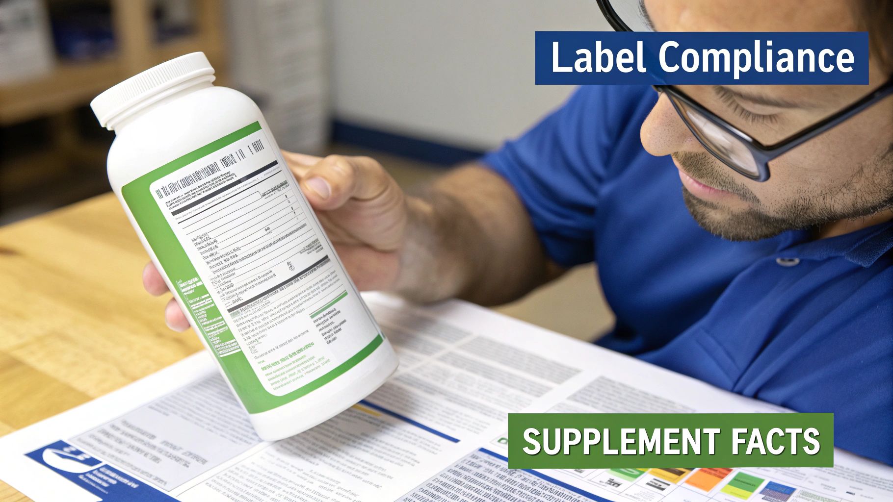
The Supplement Facts panel is the legal document that lives on your product. Every detail, down to the typography, is under the microscope of regulatory bodies like the FDA. Getting this wrong leads to costly launch delays, product seizures, or legal action. This is where a true manufacturing partner—not just a supplier—becomes your most valuable asset.
The font serves as a universal language for supplement safety, much like standardized fonts on road signs ensure immediate readability. Consumers must be able to quickly understand dosage, ingredients, and potential allergens. This isn’t about aesthetics; it’s about building trust and ensuring your product is used safely. As your R&D partner from concept through launch, we guide you through these complex rules from day one, ensuring your label is compliant and market-ready.
The Foundation of a Compliant Label
The FDA has specific rules for the fonts on Supplement Facts panels, all designed for maximum legibility. The guidance is clear: you must use a single, easy-to-read sans-serif font. While options exist, Helvetica and Arial have become the industry standards due to their clarity and universal recognition.
When it comes to size, the FDA requires a minimum font size of 6 points for most text, with some exceptions for smaller packages. Minor formatting mistakes are a fast track to non-compliance and can trigger significant penalties. You can find more details in our comprehensive dietary supplement labeling guidelines.
Our role extends beyond manufacturing your liquid supplement; we are your compliance co-pilot. We operate in a cGMP, UL certified, and FDA-registered facility, and our team double-checks every element of your label against all current standards. This proactive partnership helps you sidestep common pitfalls that can derail a product launch, ensuring speed and reliability.
A compliant label is your product’s passport to the market. Incorrect typography can get that passport revoked before you even ship your first unit. We ensure your documentation is in order, so you can focus on building your brand.
For larger brands needing ironclad consistency across product lines, some even integrate a company styleguide API to automate the use of predefined fonts. We have the flexibility and technical expertise to integrate such requirements seamlessly, from pilot runs to full-scale production.
FDA Supplement Facts Font At-a-Glance
To simplify things, here’s a quick-reference table summarizing the FDA's core typography requirements. Think of this as your cheat sheet for the most critical font rules.
| Label Element | Minimum Font Size | Required Style |
|---|---|---|
| "Supplement Facts" Heading | Larger than other text | Bold, Full-width of the box |
| Serving Size / Servings Per Container | 8 point minimum | Bold |
| Nutrients (e.g., Vitamin D) | 8 point minimum | Bold |
| Sub-nutrients (e.g., Saturated Fat) | 6 point minimum | Indented, not bold |
| Daily Value Percentage (%DV) | 8 point minimum | Bold |
| Footnote Text | 6 point minimum | Standard |
This table covers the basics, but details like placement, line spacing (leading), and other formatting nuances also matter. As your partner, we manage these details for you, ensuring your label is compliant from top to bottom.
Helvetica vs. Arial: Picking the Right Font for Your Label
While the FDA allows for any clear, sans-serif font, the supplement industry has largely standardized on two heavyweights: Helvetica and Arial. For brand managers, this might seem like a minor detail, but it’s a decision that impacts everything from on-shelf appeal to online clarity. Think of it like choosing tires for a performance car—both will work, but one might give you an edge in specific conditions.
This is a perfect example of where we act as your R&D partner, not just a contract manufacturer. We don’t just print what you send; we analyze these subtle but crucial details. A font that looks sharp in a design file can become a distorted mess when wrapped around a curved liquid supplement bottle, especially under the fluorescent lights of a retail store.
What's the Real-World Difference?
At first glance, Helvetica and Arial are nearly identical. However, small design differences have a surprisingly large impact. Helvetica is known for its crisp letterforms with perfectly horizontal and vertical terminals (the end of a stroke). Arial was designed with slightly softer, slanted terminals, which can make it feel a bit more open.
Here’s a look at a standard nutrition facts panel. It uses a font very similar to Helvetica, showcasing why its clarity is ideal for compliance.
The clean lines and even weight create an organized, easy-to-scan panel. That’s precisely what regulators—and your customers—demand.
The best choice often comes down to the physical reality of your product and its primary sales channels. We help you think through these factors:
- For curved surfaces: Helvetica’s uniform stroke weight holds its shape beautifully, even on the tight curve of a 1 oz dropper bottle. This minimizes distortion that can compromise legibility.
- For low-light legibility: Arial's slightly wider character spacing can sometimes give it an edge in readability in environments like a dimly lit cabinet.
- For print clarity: High-resolution printing brings out the sharp precision of Helvetica, making it a great choice for premium brands aiming for a crisp, high-end aesthetic.
How Your Font Performs in the Digital Marketplace
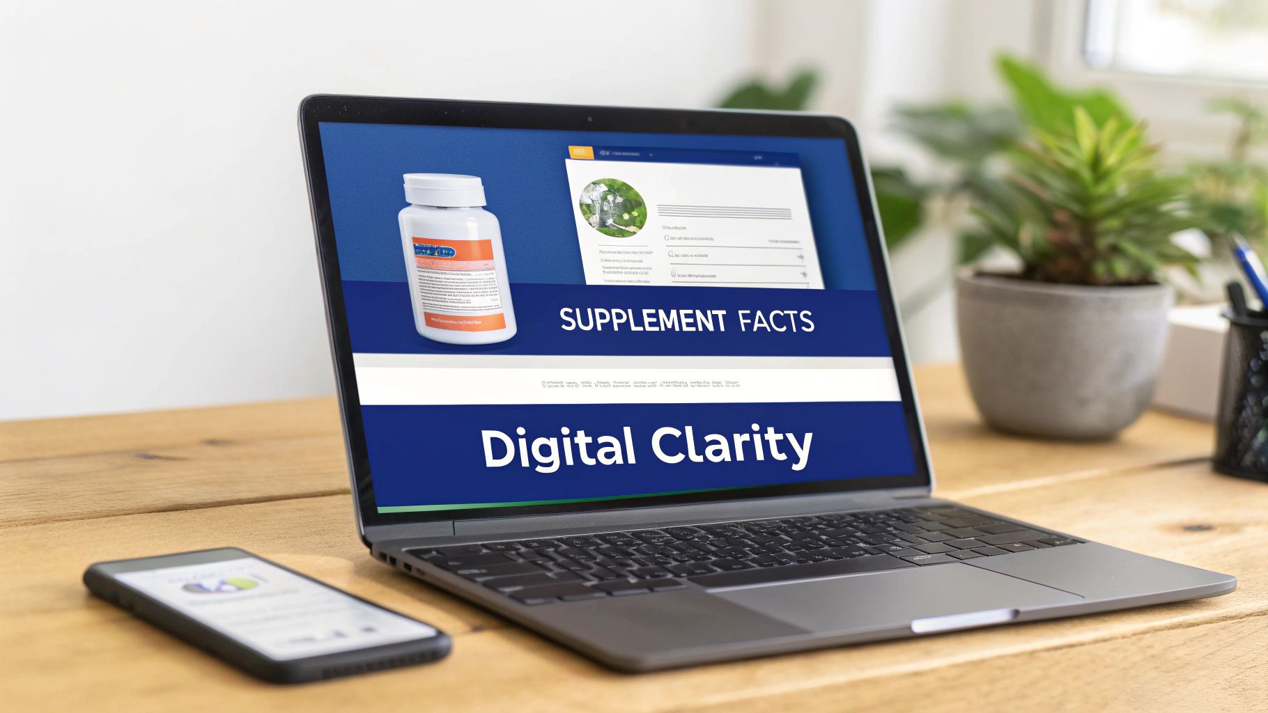
Your label’s job continues long after it leaves our advanced production line. It has a second life on the digital shelves of Amazon, Shopify, or Walmart. Here, the subtle differences between fonts become strategic.
Your e-commerce product image is your new front-of-shelf. If the Supplement Facts panel is a blurry mess on a smartphone screen, you're not just failing a compliance check—you're losing customer trust at the most critical point of sale.
Image compression on e-commerce sites can degrade fine text. This is where Arial sometimes gains an advantage. It was specifically designed for on-screen legibility at lower resolutions, which helps it resist turning into a pixelated smudge when a customer zooms in on their phone.
As your partner, we help you test this. We can produce mock-ups to show how each supplement facts font renders across different devices. This ensures your product is not only cGMP compliant but also optimized to convert in the hyper-competitive world of e-commerce. This attention to detail is part of our commitment to your success, from your first pilot run to full-scale production.
Mastering Font Size and Label Hierarchy
A compliant Supplement Facts panel isn't just information in a box; it's a carefully structured system designed for instant comprehension. The FDA has specific rules for this visual hierarchy, similar to how a newspaper uses headlines and subheadings to guide the reader. This isn't for aesthetics—it’s a functional design that helps consumers find critical information first.
As a brand manager, your goal is to translate complex nutritional data into a format that is instantly readable and, above all, compliant. Getting this hierarchy right is non-negotiable. It builds customer trust and helps you avoid regulatory issues that can halt a product launch.
The Anatomy of Typographic Compliance
The FDA’s typography rules create a clear visual path for the consumer. Some elements must demand attention, while others provide finer details. This is all about function and safety, not artistic expression.
Take the title "Supplement Facts". It must be the most prominent text, spanning the full width of the box in a large, bold font. This is your headline, leaving zero room for confusion.
From there, the hierarchy cascades down, with visual weight matching each element's importance. This deliberate design ensures a customer can quickly answer key questions: What's in this? How much should I take? What are the key nutritional values?
Key Elements and Their Required Emphasis
The FDA has updated its rules to make labels even clearer, focusing on what consumers value most. In fact, one recent analysis showed that labels with larger, clearer fonts can boost reading comprehension by up to 25%.
Following the FDA’s 2020 final rule updates, the font size for 'Calories' was increased significantly to around 16 points or larger. 'Servings per Container' and 'Serving Size' also gained emphasis and must be bolded and no smaller than 10 points. At the bottom of the hierarchy, the minimum size for nutrient quantities and the % Daily Value is 6 points, balancing information density with readability. If you're curious, you can explore more about the evolution of these label rules.
This hierarchy is best understood in three tiers:
- Primary Information (The Headlines): "Supplement Facts" and "Calories" are the stars of the show, demanding attention with the largest, boldest fonts.
- Secondary Information (The Subheadings): "Serving Size," "Servings Per Container," and bolded nutrient names (like Vitamin C) are next, prominent enough to be scanned at a glance.
- Tertiary Information (The Fine Print): The actual nutrient amounts (like "90 mg") and footnote text sit here, using the smallest fonts allowed (typically 6 to 8 points). The data is present but doesn't obstruct more critical information.
Think of the hierarchy as a guided tour of your product's nutritional profile. Our job is to design that tour so every stop is clear, logical, and meets every single FDA requirement. We turn a potentially confusing panel into a powerful tool for transparency.
This flowchart shows how common font choices like Helvetica and Arial fit perfectly into this required hierarchy, making them industry standards for building a compliant label.
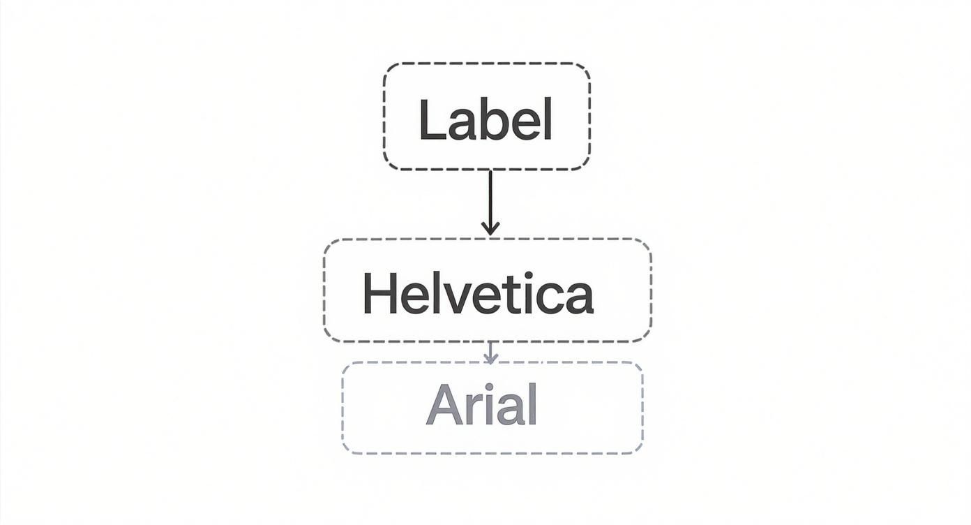
Both fonts offer the clean simplicity needed to build this multi-tiered information system. As your partner, we work with you to get this structure right every time, whether you're launching a new custom formula or refreshing an existing product. Our expertise ensures your label is an asset, never a liability.
Optimizing Your Label Font for E-Commerce Success
A physically perfect, cGMP-compliant label is a huge win, but its journey doesn't end at our production line. In today's market, your "digital shelf" is just as crucial as any retail space. A supplement facts font that looks crisp in your hand can become an unreadable smudge on a smartphone screen, damaging customer trust and conversion rates.
This disconnect is a common pitfall. E-commerce platforms like Amazon and Shopify automatically compress product images to speed up page loads. This process can degrade fine text, causing tiny characters to blur together and rendering your carefully designed label useless to an online shopper.
As your manufacturing partner, we think beyond the physical product. We know your success hinges on standing out in the crowded e-commerce landscape. That’s why our process includes planning for your label's digital life from the very beginning.
Bridging the Gap Between Print and Pixels
The solution is to treat your digital label image as a distinct asset—not just a photo of your bottle. From a shopper's view, a blurry Supplement Facts panel is a major red flag. It looks unprofessional, suggests a lack of transparency, and can make your product seem untrustworthy next to competitors with crystal-clear labels.
To prevent this, we help our partners build strategies for online success. It's about creating a dedicated, digital version of your label optimized for legibility on any screen.
Here are a few practical strategies we help implement:
- High-Resolution Renders: Instead of relying on photography, we help you create sharp, high-resolution digital renders of your label. These vector-based graphics remain perfectly crisp, even when a customer zooms in.
- Optimized Image Slices: For platforms that allow multiple product images, we advise creating a separate, enlarged image showing only the Supplement Facts panel. This makes it impossible to misread.
- Mobile-First Testing: A significant portion of online supplement sales happens on phones. We rigorously test how your label font holds up on various screen sizes to ensure clarity wherever your customers shop.
The Impact on Customer Trust and Conversion
On e-commerce platforms, the presentation of your label font on product detail pages—often called ASIN level pages on Amazon—directly impacts customer engagement. A clean, legible panel signals professionalism and compliance. For a masterclass in this, look at these well-designed Obvi's ASIN level pages.
In e-commerce, your product images are your number one sales tool. If a customer has to squint to read your ingredients, you’ve already lost them. We ensure your digital presence reflects the same quality and compliance as your physical product.
This market-aware approach is central to our partnership philosophy. We're not just here to make your product; we're invested in ensuring it sells. For brands targeting major marketplaces, this digital-first mindset is essential. Our guide on how to sell supplements on Amazon provides more context on tackling these specific challenges.
By anticipating digital marketplace demands, we help you launch a product that is ready to compete and convert from day one.
Thinking Bigger: Accessibility and International Standards
Achieving FDA compliance is the starting line, not the finish. True industry leaders understand that the font on a Supplement Facts panel is an opportunity to build a more inclusive brand and prepare for global growth. This is where a forward-thinking manufacturing partner helps you look beyond today's market to seize tomorrow's opportunities.
Choosing a clean, highly legible font like Helvetica isn't just about meeting a regulation. It's a strategic move that aligns with accessibility best practices, ensuring customers with visual impairments can clearly read your product information. This commitment to clarity speaks volumes about your brand's integrity and builds deeper trust with a broader audience.
Designing for a Wider Audience
Accessibility is about creating a better, more user-friendly experience for everyone. A clear, well-spaced font helps people quickly find what they need, whether it's the serving size or a potential allergen. This is not just good ethics—it's good business.
For many customers, a legible label is the deciding factor in making a safe purchase. When you prioritize clarity, you send a powerful message that you care about your customers' well-being, which resonates deeply in the health and wellness space.
Your label is your most direct line of communication with every single customer. Making it accessible is a fundamental part of building a brand that everyone can trust and rely on.
This focus on clarity is a core part of our partnership. We ensure your design choices not only meet regulations but also build your brand’s reputation, setting you up for success whether you're doing a small pilot run or a full-scale production launch.
Preparing Your Brand for Global Markets
As your brand grows, international expansion introduces a new layer of complexity to label design, especially regarding fonts and character sets for different languages.
Many countries require dual-language labels, meaning your font must support a wide range of characters and diacritical marks without becoming a jumbled mess. A font that looks perfect in English might fail when rendering French or Spanish, leading to compliance issues and a poor customer experience.
Here’s what to consider for international labels:
- Character Set Support: Does your font choice (like Helvetica Neue) include the extended character sets needed for your target markets?
- Readability in Multiple Languages: How does the font appear when different languages are placed side-by-side on a small label? Does it remain easy to read?
- Regional Regulatory Differences: Each country has unique nutrition labeling rules. We stay current on these nuances so you don't have to. For context on U.S. standards, you can review the essentials of FDA regulations for dietary supplements.
Navigating these international regulations can feel overwhelming, but it's a challenge we are built to handle. As your R&D partner, we guide you toward smart, scalable font choices that position your brand for seamless global growth, managing the technical details of compliance so you can focus on building a worldwide presence.
Your Final Supplement Font Compliance Checklist

Wrestling with the fine print of FDA font regulations can be daunting. In reality, it comes down to a few specific checks. We've created this checklist to help you verify the details before your design goes to print.
Think of this as your final line of defense against a costly reprint or delay. Our goal as your partner is to empower you with the tools to audit your own design with confidence. This proactive quality control is key to getting a product from concept to shelf quickly and reliably.
Core Typography and Hierarchy Audit
First, let's lock down the basics. These are the non-negotiable FDA requirements that create the easy-to-read Supplement Facts panel consumers expect.
- Font Family Selection: Did you choose a simple, clean sans-serif font? Industry standards like Helvetica or Arial are proven choices.
- "Supplement Facts" Title: Is this title the clear focal point? It must be bold and span the full width of the panel.
- Serving Information: Check that "Serving Size" and "Servings Per Container" are both bolded and set to at least an 8-point font size.
- Calories Prominence: If your product contains calories, is the "Calories" line large and bold? The standard is 16-point or larger.
- Nutrient and Value Sizing: Are nutrient names (e.g., "Vitamin D") bold and at least 8-point? Their corresponding amounts and %DV values must be a minimum of 6-point (and not bold).
Getting these foundational elements right ensures your label has the visual hierarchy regulators and customers need to understand the information at a glance.
A compliant label is built on precision. Running through this checklist isn't just about avoiding penalties; it's about upholding a standard of quality and transparency that defines a trustworthy brand.
Digital and Final Print Review
Once the core typography is set, ensure your label looks just as good online as it does on a physical bottle. Legibility across every channel—from a retail shelf to a smartphone screen—is essential.
Use this checklist for one final pass before production. This systematic review is built into our own process to ensure every label we help create is effective, compliant, and launch-ready.
Pre-Production Font Compliance Checklist
Before approving that print run, walk through these final checkpoints. This simple audit covers the practical details that ensure your label is legible and effective everywhere your customers see it.
| Verification Point | Requirement | Status (Pass/Fail) |
|---|---|---|
| Leading & Kerning | Is there enough space between lines and letters for easy reading? | |
| Print Proof Test | Have you printed a physical sample to check legibility on the actual package? | |
| Mobile Screen Test | Have you viewed the label image on a smartphone to confirm digital clarity? | |
| E-commerce Image Asset | Is there a dedicated, high-resolution image of the flat panel for online listings? | |
| Color & Contrast | Is the text printed in a single color that contrasts sharply with the background (e.g., black on white)? | |
Methodically working through these points ensures your product is set up for both regulatory compliance and commercial success. It's this dedication to detail that makes all the difference.
Answering Your Questions About Supplement Facts Fonts
When it comes to the Supplement Facts panel, typography isn't just a design choice—it's a legal requirement. As your manufacturing partner, our job is to provide clear, direct answers so you can launch with complete confidence.
Here are the questions that we hear most often from brand owners like you.
Can I Use My Cool Custom Font on the Facts Panel?
This is the number one question we get, and the answer is a firm no. While you've invested heavily in your branding, the FDA is incredibly strict on this point. They mandate a simple, easy-to-read sans-serif font like Helvetica or Arial for the Supplement Facts panel.
The reason is universal clarity. This rule ensures that critical health information is unambiguous for every consumer. Stylized fonts can cause confusion, which is unacceptable for supplements. Save your brand fonts for the rest of the packaging, but keep them off the regulated panel.
What Happens If My Font Is Just a Little Too Small?
Getting close to the minimum font size is a high-stakes gamble. Going below the FDA's minimums, like the 6-point floor for nutrient listings, can result in your product being declared "misbranded."
That one word can trigger a cascade of serious problems:
- An official FDA warning letter, which becomes a public mark on your brand's record.
- A mandatory and expensive product recall.
- In the worst-case scenario, the FDA could seize your inventory, leading to a massive financial loss.
These aren't just headaches; they are costly disasters that can derail a launch and damage the reputation you’ve worked hard to build. Our commitment to quality and compliance ensures this never happens.
Think of the minimum font size as a non-negotiable legal baseline. It isn't just a design guideline—it's a core compliance requirement. Getting it wrong puts your entire business at risk, which is something we make sure never, ever happens.
Do the Font Rules Change for Tiny Bottles or Packages?
Yes, they do. The FDA recognizes that a standard-sized label won't fit on a small vial or container. For these cases, special provisions allow for alternatives like a smaller font size or a linear layout (listing facts in a line instead of a box).
However, these exceptions are tightly controlled with their own complex rules. This is not a judgment call to make on your own. It is critical to work with an experienced manufacturing partner who knows these regulations inside and out to determine if your product qualifies and how to execute the alternative format correctly. Our flexibility allows us to handle unique packaging needs with full compliance.
Do These Rules Still Apply If I Only Sell Online?
Absolutely. The FDA's rules for the supplement facts font apply to every dietary supplement sold in the United States, regardless of the sales channel. It doesn't matter if your product is on a shelf at Whole Foods or sold exclusively through your Shopify store or on Amazon.
For e-commerce, a clear, legible Supplement Facts panel is even more critical. Your online product images are your primary sales tool. A blurry, unreadable facts panel is a major red flag for savvy customers and can kill conversions instantly. A crisp, compliant label builds trust and signals that you are a professional, credible brand.
Navigating FDA compliance doesn't have to be a source of stress. When you partner with an expert manufacturer, the guesswork disappears. At Triton Nutra Group, we become an extension of your R&D team, using our expertise in botanical extraction and cold-fill technology to ensure every detail of your liquid supplement—from the custom formula down to the font—is perfect. Our rapid, transparent timelines mean you get to market faster.
Ready to launch a compliant, market-ready product without the worry? Request a free quote today.